Kanji In Action
I’ve wanted to do something visually fun with kanji on this site for a while. Now while I can’t draw, I can type out kanji. And that’s a skill, right? So I thought I would try out a bit of a kanji-themed 4-panel manga, hoping to educate (in a silly way) and entertain your kanji needs. Or at least entertain myself. Here are the 5 episodes that were created for the series:
Founder of Jalup. iOS Software Engineer. Former attorney, translator, and interpreter. Still watching 月曜から夜ふかし weekly since 2013.
Hah, it’s all fun and games until the pictographs break down. Doing 離 in RTK last night, and my wife looks over and says: “Is that a guy with no pants on trying to climb a ladder?”.
At least I’m not likely to forget it now XD
Ahh, Heisig makes a such a fuss about that kanji in his book! But it’s not so bad. There’s a great story on koohii.com by LazyNomad about Chi (http://kanji.koohii.com/study/kanji/1492). I didn’t use his story verbatim but it was much more helpful than Heisig’s ‘You’re on your own with this one’ attitude.
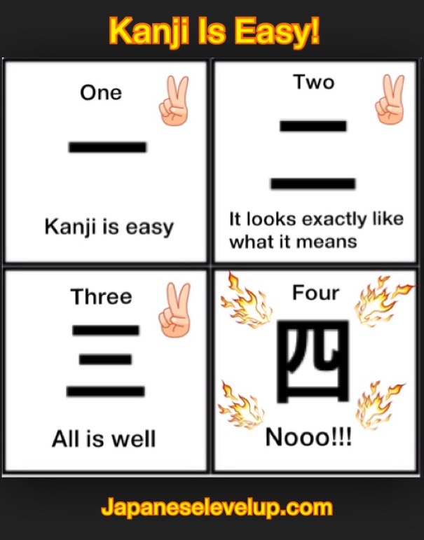
He made a fuss about the number 4? Or about kanji not looking like what they mean?
And the pictographs do tend to break down pretty quickly!
It’s always the crazy stories that give us the strongest memory so thank your wife!
Rumor has it this is also why 四 and 死 share the same sound ;)
It would all make sense.
Hah, I love this series. Keep ’em coming :)
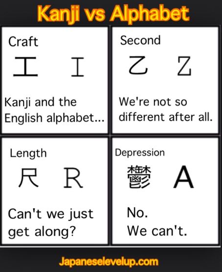
Ah, good old 鬱…
It’s actually my kanji of choice when I want to show someone a complicated kanji which I know how to draw, lol… Not sure what my favorite was before that… maybe 繭…
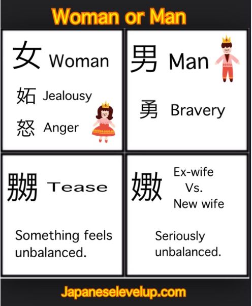
「女三人寄れば姦しい」
There seems to be no kanji make out out 3 男’s, though… Going by the examples above maybe they thought it could only possibly represent something unspeakably awesome, and just couldn’t find something that measured up? :p
It’s also strange that there are very few 男 kanji at all.
There’s also kanji like 妊, which I imagine is the husband saying, “You’d better be pregnant with a future king there.”
Gotta have high expectations for your children.
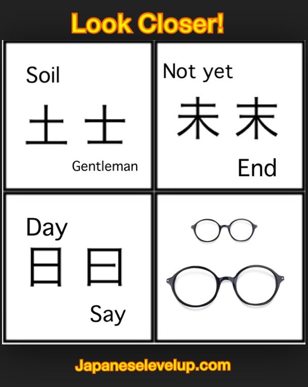
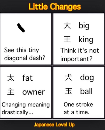
Oh man, this is the worst when I’m trying to read something with small font. I need to invest in some form of portable magnifier >_>
And then there are also those cases where even a magnifier wouldn’t make much of a difference. I remember seeing a cramped up 「繭」 kanji when playing ソーマブリンガー on my DS and thinking about how much of the detail in that kanji was unrecognizable (or rather, not present) due to insufficient pixel density.
Luckily you start to get the hang of the kanji even just from it’s general shape. With normal font size on a computer you can’t see the 糸 or 虫 in there, but just knowing that kanji shape adds to recognition.
That’s the benefit of any e-reading in Japanese as you can just raise the font size.
Oddly enough this is one of those things that messy native handwriting makes easier. People tend to exaggerate the differences.
True. One of the few areas that handwriting doesn’t make horribly worse.
もうひとつの例、鳥と島の違いを覚えるのほうがいい。
This was on my JLPT N3 test from a few years back and I am still glad I knew the difference.
Yeah, there are a lot of pairs like that have just one tiny switch in radical.
I offer this as proof that I’m not sexist just because 99% of my mnemonic associations are!
Hah. For better or worse, kanji are the way they are.
I learned that last kanji from anime!
http://i.imgur.com/q9jmGcl.png
天才!
Nice. I also like Heizig’s corresponding example from English: internal vs infernal.
I wonder what that looks like to a non-native reader. To me the words look and feel completely different, and the effect is immediate. There is no resolution interval, where they look similar but then resolve separately. Its only when I stop reading them, and actually inspect the letters that I notice the simillarities!
Interesting point about this occurring in English as well.
I know there are a lot of non-English-native users on this site. Anyone want to provide their input on how this type of minor difference feels in English?
The first keyboard is the best ever! kkkkkkk